Type Workshop
- Feb 16, 2016
- 3 min read


In this workshop we were asked to do 3 different tasks including talking about book covers that intrigues us amongst ourselves , create portraits of ourself out of a given type and making our own type. I thoroughly enjoyed hearing the various opinions on what makes a book cover interesting as I showed me that not everyone necessarily drawn to the same kind of book cover as say, the next person is. For example, some may find book covers that contain no text, only imagery very interesting however others may prefer book coves with type. I personally prefer book covers with prominent imagery as I feel that pictures are often more interesting than type upon first glance however, I do not mind when type is treated like imagery. During our discussion, we also talked about whether or not negative space played a part in book covers and I feel that yes, yes indeed it does as negative spaces can be used to balance type or imagery on a book cover to prevent the cover from looking to busy, allowing the more important words or imagery to stand out more. Colour schemes was also another topic that propped up in our discussion of book covers and it turns out that even though colour schemes do play a role in making a cover more or less interesting, it wasn't the limiting factor.
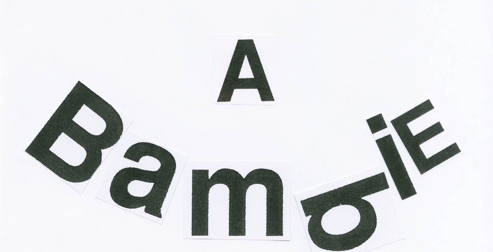
Task two then asked us to produce portraits of ourselves using either our first name, surname or initials. I also really enjoyed this task as it taught me how to look past the importance of type and really treat type as if it was just another form of imagery. This task also made me think more about whether or not I want to reproduce my portrait fully or just partially. With the limited amount of time and type given, I decided to recreate my button nose and smile from type as it is my most recognisable traits and placing the type in such a way that doesn't conform to the traditional grid way expressed my playful character.
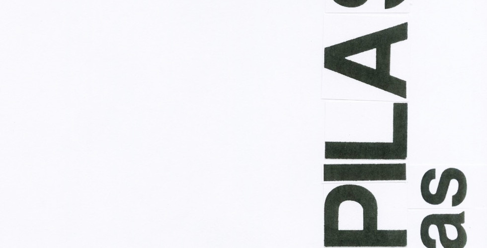
When done with the task ,I then proceeded to further experiment with a different type of text, my surname to see how it works. I have decided to place my surname in the bottom right corner of the book cover design and repeat it using two sizes of text as my family as very big and we prefers things scheduled and in order. I left out the rest of the cover as I felt that having two relatively long words right next to each other is very busy and therefore needed to be counteracted with negative space to make them appear more important.
For the final task, we were all asked to recreate a typeface of a word that had no direct meaning. I was given the word “Just” and initially I wanted to create a very simple typeface in black and white as I felt that it conveys the meaning of the word very well, which was to be exact about something when used as an adverb. However. the word just doesn't have only one definition and I wanted to explore more into the other use of the word. For example, when used as an adjective, ‘just’ can mean ‘based on or behaving according to what is morally right and fair’ therefore originally I thought about morals and government and maybe cutting the word out of a flag of a country known for its morals however, as I work with animals I started to think more about animals in zoos and the controversy surrounding the topic so I decided to create the typeface using cardboard then proceed to wrap the paper with the type on it in bubble wrap to in a way, conceal the word suggesting how not everything is black and white and that there are pros and cons to everything.
We were then asked to take our typeface , photocopy it onto acetate and then find imagery of texture that best works with the type to describe its meaning.


Comments