

Looking at space.
On Thursday, I as a member of the curation team had to opportunity to go and look at Dove Street Studios. Even though there have been pictures and a small description included in an email sent out by Peter, it was very good to be able to see the actually space and the dynamics within that space. Furthermore, the second floor where the workshops will be held we a lot bigger than everyone have expected and so we had an idea on how we can plan our workshop that will allow both the materials required to fit into the space allocated as well as for the final outcomes of the workshop to look strong enough when left on the table. I personally could have not wished for a better place as the angular architecture structure of the room is really reminiscent of what we wanted to do in our workshop- to create buildings and fill up a square table. Therefore, when placed in such location, the outcome and the architecture will mirror each other.
It was really interesting for me personally, to see an art exhibition space that doesn’t follow the conventional white cube. Even though at first I was quite concerned due to wanting a completely plain white wall as our layouts are very precise and therefore we felt would work best in a space without a lot of noise, over time, I started to appreciate to unconventional space more and more as such space I felt really encourages discussion and interaction and as our work is based on a topic with a lot of differentiating opinions surrounding it as well as the subject being interactive in itself, it worked out quite nicely.


Proposal and Blurb.


In this workshop, we wanted to bring across and ground the idea of modern mass produced housing, in particular, the complications and issues surrounding this type of housing. As mass produced housing is often commissioned by the government as an efficient and money-saving solution to combat the Housing Crisis, architects often revert to basing their design on one solution that they felt majority of the population would fall under. However, the population is made up of people from different walks of life and therefore a house designed for a single bachelor for example, won’t necessarily be able to provide for a family of four. With this in mind, we have therefore decided to conduct a workshop where our participants will be provided with pre-cut net shapes of a prism, with sides already stuck with double-sided tape and stickers. We wanted to provide a pre-cut net shape of a prism in order to visually mimic modern mass produced houses and as our shapes are inspired by Le Corbusier’s ‘Le Modulor’, by providing only one type of net shape, we will also be able to address the problems surrounding people being put into these housings. Additionally, we wanted to put the final outcomes of our participants in a grid in order to visually mimic a housing block and therefore by conforming our net shape into one, we will be able to achieve this. We have also decided to calculate the net shape so that the surface area of the sides of the net shape is only slightly larger than the height of three square stickers, we wanted to seem as though we were providing our participants with choice, although realistically, we were restricting their methods a fair amount. By doing this, we hoped that our participants will feel some sort of frustration due to not being able to freely place the stickers and therefore, we are furthermore suggesting that modern mass produced housing does not cate for everyone, even though they appear to be.
We started the whole process of trying to create stamps for our workshop by using Lino to try and cut little shapes. We had to choose this process due to the Laser cutting facilities being all booked up and hence, unavailable. We chose Lino initially, as the medium for our print due to being particularly inspired by Max Bill’s posters. As Max Bill’s posters were produced prior to technology, by achieving such clear crisp lions with a Lino, Max Bills was able to create precision to the same level as a computer and therefore, suggest the human element within production. Therefore, by conducting our workshop this way, we will be able to suggest the human element within our work. Unfortunately, we were presented with a few issues with using Lino, the first issue being that we wanted the stamps to be as precise as our laser cut wooden blocks but wasn't able to achieve such precision using Lino due to the give and flexibility of the material coupled with the small scale. We were able to cut the straight lines to a high level of precision, we still found it very challenging to cut our shapes that included curved sides. Unfortunately, most of our shapes involved circles. Furthermore, we also would have had to cut every shape three times, allowing the shapes to be printed three times, in three different colours without the worry of colours blending together. We were first going to divide our group into preparing the stamps, preparing the ink, and preparing the net shapes. However, due to time constraints and feeling that we aren’t able to achieve the concept in which we are trying to bring across from the outcomes, we, as a group got together and made the conscious decision to print out the shapes of sticker paper. We used our previous shapes and colour matched the colours to our prints. The stickers printed out really well. They turned out very bold read very well when stacked on top of each other when stuck on our net buildings.Initially, we wanted to use architecture paper in order to aid us when we come to cut out net shapes as well as allow the paper to fold with sharper, cleaner lines. However, we quickly realised that the architecture paper only allowed us to straight fold in one direction, therefore, we have decided to scrap that idea. The reason we chose architecture paper in the first place was due to wanting an existing guild line already built into the paper, obvious yet non obtrusive, in order to suggest how modern mass buildings on the outside, although appear to provide its residents with choice, its one equation based design communicates otherwise. Therefore, we went on to using photoshop to create a grid where the stickers will fit as well as allow us the easily cut out the net shapes.
Due to our group wanting to encourage discussion and debate about the modern mass produced housing and the views surrounding it, we have decided to invite architects as well as due to the people in this field being very familiar with this subject and therefore, by having them take part alongside students or other members of the public that may not necessarily know a whole lot about modern mass-produced housing in terms of design wise, our group felt that it would be very interesting to hear about the different views each party has on the subject.
Exploring Modularity through stamping.


The Workshop.
Our workshop, we all found, worked a lot better than what we expected. Although the outcomes were not as expected, with students creating shapes that does not conform to our prism, we found that through this workshop, we were able to get a unbiased perspective on modern mass produced housing from our friends and peers. Initially, we decided to explain the goal and the context in which our workshop is based upon, but after witnessing students not conforming to the standard shape, we felt that it would be more interesting for us to not explain the context at all and hence, compare the two type of outcomes. When briefed, we found that students with a negative view on mass produced housing tended to not conform as much to the provided shape thus, creating a new shape. On the other had, when no brief was provided, students tend to conform more with the nets provided.
My group and I were very surprised when a student completely transformed our provided net shape as we didn’t expect our participants to necessarily pay any significant attention to the shape and would instead pay more attention to the placing of the shapes thus, this was a surprise. However, when asked, the student expressed a negative opinion towards mass produced housing. It was at this time that I remembered how Le Corbusier’s housing project was not popular at first, and only began to gain attention and ultimately get commissioned by the French Government after the World War has destroyed a lot of buildings. Le Corbusier was contacted to build several housing units due to his modular designs allowing for a very efficient and low cost building. Therefore, as this fact was experienced in our workshop as well, it gave my group and I the opportunity to see other perspectives surrounding mass produced housing from people who aren’t necessarily familiar with Le Corbusier or architecture. And maybe, modern mass produced housing isn’t as popular as we thought it was.


Above :
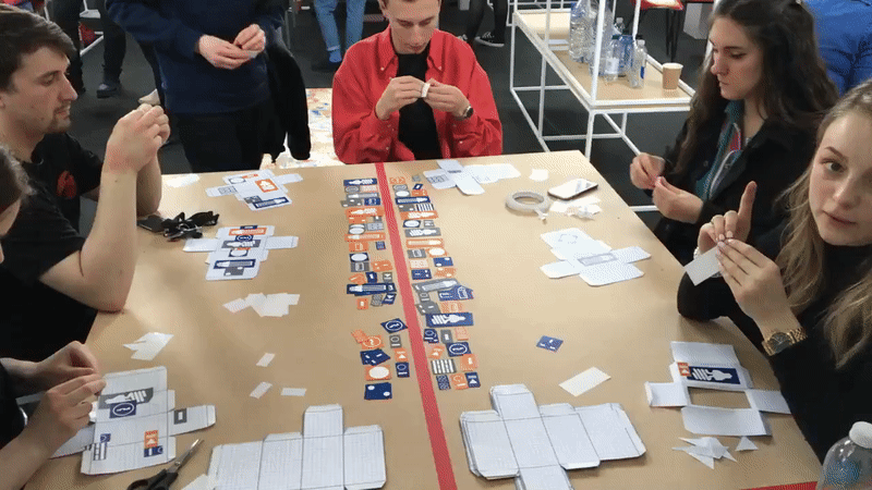
Workshop in Action
Below :
Three outcomes with very different approaches. The first outcome was done by Peter, a graphic design approach (did not get briefed), the second outcome was done by Jess, a student doing work about horror and distortion within architecture (got briefed), the third outcome, done by a member of our group (got briefed)
Exhibition Preparation.
All in all, conducting the workshop have provided us with a different perspective by acting as a starting point allowing my group and I to discuss modern mass produced housing with the members of the public. My group have enjoyed conducting a workshop which is based on the ideology of our group practice more than we initially thought we would due to through the workshop, we felt that our ideas were grounded and therefore gave another level of context and depth to our work and a chance for us to perceive our own work from a different perspective and critically analyse it in order to improve ourselves in the future. I personally, have thoroughly enjoyed this exhibition in general, not only the workshop, due to not having any experience with holding an art exhibition outside the conventional white cube. Therefore, this experience was very eye opening as the galleries I have visited are all white cubes and have never conducted a workshop during my visit. Therefore I have never been to an art workshop, let alone conduct one. By holding our exhibition in such space, I felt that the exhibition became very informal and aided us specifically me, as artists, to interact and talk about our work and the ideology in which the work was inspired by to the public, helping me gain confidence along the way in talking to people who do not attend the same course as me about my creative practice as well.
I have also had the chance to be a part of the curation team in both putting up the work and curating the process table. Although challenging at times, being a part of the curating team has helped me improve and work on my editing skills. For example, as we were curating the process table the morning of the exhibition, my team and I found ourselves having to juggle, in a very limited amount of time, with linking the contextual aspects, the colour themes and the visual elements of work from all across the board in order to be able to place the work in an order that will both enhance and balance each other. Thus, creating a very visually strong process table that will invite people to analyse and interact with the work whilst gaining more insight into how the different groups worked and took on the prompt provided in order to produce the outcomes on the wall. We also found ourselves having to put aside the want to please everyone and hence, only allow ourselves to place artwork that we feel will contribute to the overall visual impact of the table.
In conclusion, I would love to conduct a workshop again and am considering conducting one as another way of gaining primary research as well as new perspectives for my report due to the benefits it has provided my group and I with. I have also thoroughly enjoyed the day especially the different events held by the different groups and have found very interesting how placing the work in regards to the space given can encourage discussion and narrative within the work thus, giving me a new perspective on how spaces like Dove Street Studios that do not conform to the traditional ‘white cube’ can enhance my creative practice maybe even more so than a typical white cube can. I was quite concerned when I saw the location initially, as I felt that all of the visual noise in the space, be it beams or tables or the red accents may pull attention away from the artwork. However, I was proven wrong therefore, in further situations where I am given the opportunity to put up my work, I will focus on more of how the space can work in favour of my creative practice instead of just sticking to the white cubes and whether or not each location suits the context of my work.
Analysis.


Curating the Process Table.
On the day of the exhibition, as I am part of the main Curation Team as well as the Curation Team for the process table, I had to opportunity to test and put my editing skills to use. Although challenging, I found myself thoroughly enjoying the process of editing artwork down. I particularly enjoyed the challenge of trying to find a link in between the work that will allow them to sit nicely next to each other on our table. Initially, we started with only one table due to a lack of work being handed in as therefore, we decided to all go back to either our respective groups or our own sketchbooks in hopes of finding more progress work that could potentially enhance the already existing work chosen. We had a fair share of books, a few three-dimensional objects and quite a few prints. At first, we felt that it might work best when all three dimensional objects were placed on the middle, surrounded by work that lies flat. However, due to the increased quantity of work and hence, the addition of another table, when the three dimensional objects were placed in the middle, we all felt that the table did not look as strong as we thought it would as the middle ended up looking too compact. I then suggested that we try to evenly distribute the three-dimensional objects as much as possible in order to introduce some balance to the table. This helped a lot as we felt that the work that laid flat tended to blend into the table and therefore, by placing the three dimensional objects evenly, we were able to link the whole two tables together. Furthermore, we were faced with the clashing of stark white paper against oatmeal paper and therefore, had to work out a composition in which a more colour rich print would end up in the middle of the two. Even though I did enjoy curating the progress table, I did find it quite challenging when other students come up to our team, asking about the reason as to why their work did not end up on the table. I found myself having to explain the complications concerning available space, context and colour and therefore, even though I felt really bad to not include a particular piece of work, I felt that it was of higher importance to be able to edit work down into a series of work that both when placed in close proximity enhance each other, but also, explain the different process the different groups undertook and therefore, this compromise was necessary.


The Day of the Exhibition.


At first, we tried to print on layers however we mustn't have waited long enough as the first layer of ink and the second layer blended together. Jess then suggested adding dryers to make the ink dry faster. However, even with the added factor that the ink dries faster, we were still unable to achieved an opaque yellow on top of the navy and grey as ink put down prior gets absorbed by the MDF, seeps through and blends with the yellow ink on top, turning the yellow into a green. Which resulted in the print not working under colour filtering lenses. We have chosen to go with blue, yellow and grey due to blue representing the utmost necessary element of nature, water; accompanied by yellow, representing electricity and lastly, grey, a colour now seen everywhere due to the use of cement within modern architecture and ever since it was introduced in the 1900s, it was been used to construct almost all infrastructure from pavements to buildings due to its strong properties, it is clear that whatever was built with this newly developed material was built to last.
In addition to the problem with colour, we were also unable to align the layers perfectly as well as keep the surrounding paper fingerprint-free therefore not allowing us to achieve the clean and crisp finish we felt were crucial when portraying modern architecture . Therefore in between the printing days , we had two of our group try and digitally manipulate the shapes into both layouts that we all liked and colours that worked underneath the coloured acetate.
After discovering Illuminature, we wanted to try out incorporating an interactive feature within our prints as we were inspired by how this feature will allow the people looking at our prints to be able to looking at them again and see the different elements i.e architecture or nature separately. With this in mind, and having learnt from our mistakes from the first relief printing, we have decided as a whole group to introduce more geometric shapes and squares are the previous relief printing showed that such shapes slotted better together and worked alongside each other more within the same layout. We wanted to use shapes that slotted well together as well as of the same sized as we were wanted to layer the prints and even though the shapes within the squares are all different , we still wanted the squares to all perfectly align together as we felt that this will reflect the clean lines often found in modern architecture.
Process.


As we wanted to replicate the layering within architecture, we decided to layer our prints. However this plan didn't work out as well as we wanted due to us not being able to achieve an opaque top yellow layer which consequently, our prints ended up not working under our prepared coloured lenses. Thus, we decided as a group to instead of struggling to achieve clean prints via relief printing, we would digitally manipulate the prints instead. We found this out when we got back from our group members who digitally manipulate the print, how efficient and time saving it was to digitally manipulate the prints instead as the prints themselves not only will the colours they turn out more opaque and clear, the lines and shapes will also turn out more crisp as well as eliminate any possibility of fingerprints in which subsequently, will also help the different shapes appear clearer when looked at through coloured acetate.
Analysis + Reflection.
After having decided as a group to digitally manipulate the prints, there was also the subject of whether or not we wanted to maintain the texture of a relief print or whether or not we felt that the look of a digitally printed piece will work best. In the end, we all decided to maintain the texture of the relief print within our final prints as we felt that the uneven and sometimes faint effect of the print is what makes certain elements within our prints appear organic. For this purpose, we then went ahead and printed all of the shapes once in each colour in preparation to scanning them in order to digitally manipulate them. ( Top Row )
In hind sight, we really ought to have waited for the ink on the previous layer to fully dry before printing on top however, we are still glad to have tried the different possibilities with composition physically and be able to use this session to play around with composition, edit down our shapes to what we felt worked most and in the same way, develop ideas despite less than perfect outcomes.


As a result of colour matching the various elements found in nature and their mechanical counterpart, I have found that within nature, Blue, Orange and Green seems to be colours that crop up quite a lot ( water, fire, leaves ) whereas in modern architecture, metals and plastics are being more wildly used due to their ease of care , inert qualities and sustainability . Coupled with the rise of Modernism in the 20th century, there has been a significant drop in unnecessary details therefore that colours like Grey, White and Cream are more common amongst modern architecture. Leading to paraphernalia such as gardens are being replaced by hydroponics for ease of use.
Analysis.
 |  |
|---|---|
 |  |
 |
 |  |  |
|---|

Habitat.
habitat
ˈhabɪtat/
noun
noun: habitat; plural noun: habitats
-
the natural home or environment of an animal, plant, or other organism.
"wild chimps in their natural habitat"
After reading through all the briefs provided, the one that spoke out to me the most was Habitat. The brief focuses on primarily on how we interact with architecture, how it interacts with us and I knew that this was a concept I would like to touch upon and develop further within my creative practice.
Research.
This text talks about how people often look upon ‘doubling’ to be associated with ‘mirror-images, shadows, guardian spirits etc.’. Freud for instance, to him, the Döppleganger was repellent for invoking animist reactive in which an effigy, mask or statue would be forged as insurance against mortality. Therefore in other words, a form of decoy- a hiding place for the soul. In novels, döpplegangers are the ‘nemesis’ are co-existive therefore often seen as a highjacking of the true self and as a result of being portrayed as such, the ‘individual’ remains our preferred vision. Most humans are comfortable with siblings existing in an expected range of resemblance however, identical twins are often considered a sinister omen, nature’s anomaly or a contravention of it’s deep set laws. As you can see, döpplegangers are not deemed natural therefore the human mind views such concept as a threat with the later version often identified as the sinister version of the first.
Shapes within Architecture.
Colours.
Analysis + Reflection.
Using the printing blocks that we had made gave us a good idea of what we wanted to take forward and what parts weren't successful. We found that using the yellow ink on the newsprint was too transparent and didn’t show as clearly as we’d hoped and bigger shapes were unable to produce a solid colour as the surface area was much larger. From this, we learnt that when creating the printing blocks we have to communicate better as a group and design the printing blocks together as opposed as designing them all separately and then bringing them together when it comes to printing. We learnt this because we found as the blocks hadn’t been designed to print together, many of the images didn’t link and looked too scattered (they didn’t compliment each other).
Out of our prints, we found the ones that incorporated nature and architecture together worked the best. From this we’ve decided to go in a new direction and looking at how nature is duplicated and copied within architecture.

Shapes from Architecture
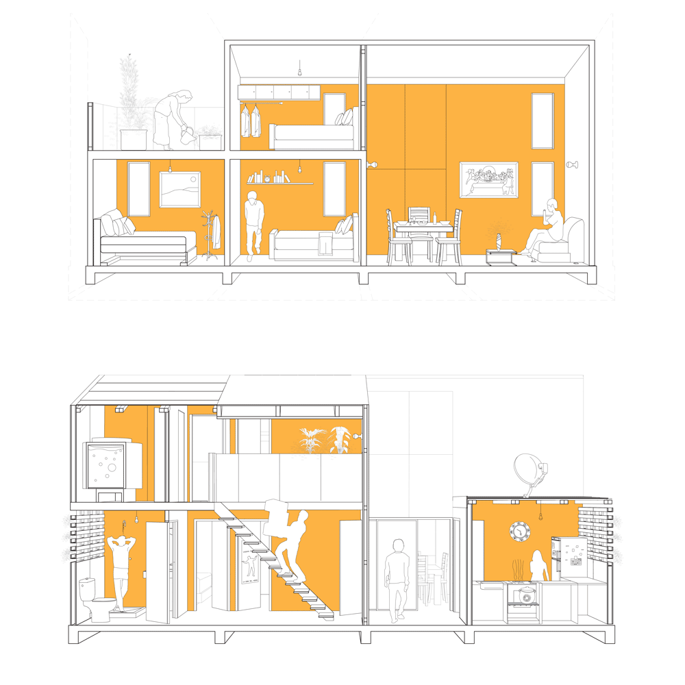
After discussing what common interests each one of us have with the rest of the group, it has been brought up that all of us had a shared interest in rituals and habits. Rituals are routines that every person perform from day to day. Even though a person’s routine may differ from the next, the basic routine i.e brushing their teeth, are still consistent in everyone. Therefore, my group and I think that it would be interesting to focus on how architecture caters to the ease of performing of these routines. With this in mind, we have decided to separate and take pictures of either elements or architecture within our homes that we interact on a day to day basis and from there, create imagery that represents them.
I have decided to base imagery on the heater, plug socket and door hinges due to interacting with them most and without them, I wouldn’t be able to perform necessary rituals for example, without the plug socket, there would be any electricity in order to charge any devices and similarly, without the hinges, my doors won’t be able to perform its main purpose and therefore, useless.
Nature.
Man-made.


Elements that didn't work within our prints :
Figure 1.1
-
The yellow ink did not work as well as hoped against the blue.
-
The yellow used was too transparent and light that it seems to blend into the paper.
Figure 1.2
-
The shapes ended up looking too scattered.
-
Due to the shapes looking too scattered, there seems to be too much going on.
-
None of the shapes were designed to go together due to miscommunication within the group therefore when placed together, the layout ended up looking unbalanced.
Figure 1.3
-
We were unable to achieve a solid colour with such a big surface area.
-
The choice of paper didn't work well as the stark white does not work well under the inks chosen.


Elements that worked well within our prints :
Figure 1.1
-
Good use of negative space
-
Stacked , Balanced
Figure 1.2
-
The thin blue ink made it possible to make out the yellow printed prior, creating an organic look.
-
The overlapping of the colours suggest shadows and the idea of trying to confine nature within a man made structure.
-
Choice of yellow, blue and magenta work well together.
Figure 1.3
-
The use of simplicity and symmetry created a minimalist yet strong image
-
Shapes placed in the same layout seems to slot together well.
Figure 1.4
-
Good use of space.
-
The use of objects that are linked to the same subject works well.
-
Using one colour really well.
Figures 1.5 - 7
-
The ghost prints visually are very interested and organic


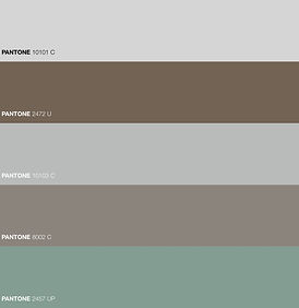
Even though most of our group were satisfied with the way orange and blue lies together within a layout, I still felt that it might be beneficial to try and pick out other colours commonly found in nature and architecture in order to use them to represent their respective categories. With this in mind and the fact that our concept is about how humans try to incorporate and/or duplicate the nature within architecture, I have decided to colour match colours within architecture using Pantone in hopes of finding a colour ( or a set of colours ) that resonate throughout nature - and likewise with architecture.
Second Relief Printing Session.
Group Crit with Peter.
Analysis + Reflection.
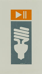
On Thursday, we were able to sit down with Peter as a whole group and discuss our outcomes and the process leading up to that stage as well as what direction we felt were best for our project. After showing Peter the outcomes that our group as a whole felt worked the most and explaining the ideas underlying them, Peter has brought to our attention that our designs were not as strong as they potentially could be and therefore would need further development in order to achieve and outcome that is as graphically strong as it is aesthetically. He also highlighted the fact that some shapes were not clear enough and therefore such shapes will need revisiting in order to make them as clear as the rest. For example, the lightbulbs used within our layouts from the first relief printing session held too much detail and were based on old fashioned bulbs therefore from further away, one could easily mistaken them as a hot air balloon. Furthermore due to increasing awareness of global warming, eco bulbs are more wildly used now. Therefore ,it would be more suiting to look at the modern eco bulb and what the electricity industry use in order to represent them graphically and then model our graphic imagery after this in order to make our prints more relevant to 2017.
In addition to the slight concern with the simplicity of the shapes, Peter suggested us take inspiration road signs and how the use of negative space lends itself allowing the public driving by to make out the action portrayed by the sign clearly and apply this concept to our own signs in order to create imagery that is as graphically strong as these.

Left:
This print communicates across uniformity. Its use of solid colours with little negative space in between indicates the architecture is built to last. Moreover, its easily recognised graphical symbols symbolise a straight forward environment where things are set to default. Furthermore its very simple stacked layout reflects how modern houses are often stacked on top of each other and mass produced.

Right:
Even though this print is very visually playful and interesting, we felt that it was reflective enough of the housing crisis in 2017- due to its playful, off centred nature, its indicates at a more personalised house rather than an architecture that has been mass produced in hopes of counteracting the problem.
However, despite our slight disagreement on which prints work and which didn't, we all agreed that stacking our shapes on the print produced an image that accurately reflects the how the council is trying to cope with the housing crisis - which is to build more apartments. Therefore, with this in mind, we have decided to forget trying to incorporate the interactive element for now, and focus on creating 6 layouts of stacked shapes for example, in each layout, there would be 2 squares and a rectangle with the insides of the shapes differentiating from print to print. We believe that by creating 6 layouts of essentially very similar imagery, we will be able to convey how housing in 2017 is more or less mass produced with the only difference being design so essentially, illustrating the typologies in modern mass produced housing.
Moving Forward.
In the same way, Peter also suggested us narrow down and specify what exactly we wanted to convey via our prints about the way we interact with architecture i.e a specific flat, someone's window sill etc. It was during this discussion that we were talking about not exactly the way humans have duplicated nature via architecture but how humans have used architecture to create a habitat within our own homes that I thought back to when I first bought my house in Norwich and how it had only came with the basic things a person would need to live in it i.e electricity, plumbing, heating etc. Therefore after discussing with my group, we have decided to move away from the concept of duplicating nature to more of how humans have used architecture as nature being the inspiration to create a habitat for humans.


Jack Self, amongst other artists, have picked up upon the housing crisis in Britain and have worked collaboratively alongside other artists from the creative industry such as engineers, artists, fashion designers, photographers and filmmakers to present new models for living under a project commissioned by the British Council called " Home Economics". The project aims to present 5 new models for living with each room addressing a different fate of the crisis of living, from ways of preventing speculation and exploitation in real estate markets to how sharing can be a form of luxury and not a compromise. This project was produced with inputs from architects, developers, financial institutions in order to really address the issue as a whole. Home Economics also argues that by designing first with time instead of space, they will be able to overturn the functionalist perspective or wester architecture and reinstate a rationalist understanding of dwelling as well as the idea of sharing a number of common objects with neighbours from practical things ( i.e. power tools ) to clothes that the residents can better afford together, keeping these objects in large transparent ' Garderobes's . ( Jack Self, 2016 )


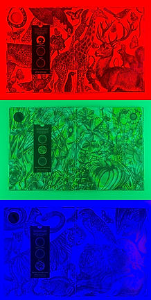
As we were discussing about the colours and which colour combination we felt suited our concept, a couple of group members have suggested we try incorporate an interactive element via colour filtering. They were inspired by Illuminature, a book by Carnovsky and Rachel Williams. This illustration book about wildlife uses colour filtering in order to distinguish between plants, nocturnal animals and diurnal animals. This book works by offering the reader a device with 3 colour lenses in which each lens work by absorbing certain wavelengths of colour and transmitting other wavelengths therefore all colours of light except the one identical to the lenses will be absorbed, allowing the reader to see only the illustrations in that colour. We all agreed that incorporating this interactive element within our work strongly in our favour as our main goal were to convey across how humans are trying to recreate nature through architecture and therefore by using this technique, we can offer a range of prints where people viewing our work can look through different lenses and see which part of our prints are derived from nature and which part, their architectural counterpart.
Illuminature.
Making Nature.


Making Nature is an exhibition that explores how establishments such as the Natural History Museum and Zoos create a “representation of nature” and how they subsequently aid our views and understanding towards nature. This exhibition explores a total of four themes in which they believe scientists use in order to catalogue nature. The four themes are Ordering, Displaying, Observing and Making.
The Ordering element of Making Nature delves into how “Natural Order” in the living world has become embedded in our society. Ordering has started when during the 18th Century, the science of naming , describing and classifying organisms started seeking rational explanations for the perceived differences between human and non-human animals leading to the development of the Linnaean Classification System. Therefore organising nature is a concept produced by artists, writers and scientists.
The Displaying element however, concerns itself with how animals can be visually seen in carefully arranged exhibits, the choices museums make about what animals are on display, what posture certain species are in and how such appearances influences the way people have come to think of those species of animals.
The Observing part alongside Displaying , also explores the way animals are displayed however, unlike the latter, this part focuses solely on animals displayed in a zoo environment. Overtime, exhibits have developed too offer more of an authentic experience therefore Zoos are no contend with the challenges of exhibiting “authentic” looking nature in unnatural environments. This process that stands throughout history reveals how concepts of nature have evolved and tells of a modern tendency to romanticise wilderness.
The last process explored in Making Nature is the Making Process where humans would create and engineer animals. This component of making nature became more known when the Centre for Post natural History was founded back in 2011. This centre collects as well as records organisms that have been intentionally altered by humans such as dogs via selectively breeding and domesticating, to BioSteel Goats, all in which fall under the term “Post-Natural”.
All in all, this exhibition allowed me to see how humans are also through observing nature, creating another nature of their own in which they can understand and wrap they heads around. This concept also led me into thinking, what else has man borrowed and mass produced from nature ? After discussing this with my group, we all agreed that not only are humans duplicating other non-human animals in order to allow us ease in our daily living, the most basic necessities are also a concept borrowed from nature. Everything from plumbing right down to electricity is helping us create a habitat of our own, built by humans for humans.


 |  |
|---|---|
 |  |
Jack Self -
Home Economics
What stood out to me the most during the visual presentation given by Peter were Jack Self’s work from his project, Home Economics. These series of images stood out to me the most due to the fact that they work so well when put in a series. I really liked the way Jack Self, by creating a series or work, suggests that in order for a house to be inhabitable, a lot of objects must work in parallel in order to allow the inhabitant to be able to function.
The use of very simple composition as well as colour blocking is representative of the mass produced houses that have been built to salvage the housing crisis and therefore include only the basic necessities and therefore very simple. In the same way, the colour surrounding the white frame is also reflected within the photograph located inside the frame and therefore ties the whole composition together.
 |  |
|---|---|
 |  |
 |
On Wednesday, we had a workshop with Peter where we brought in everyday mundane objects that we interact with habitually and focus on bringing out their shapes, simplifying them.
We were later shown imagery that other artists has created in response of the idea of recreating and highlighting everyday objects or architecture that are often ignore, bringing forth their history and how they impact us.
 |  |
|---|---|
 |  |
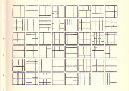
The reason why Karel Marten’s Letterpress on Paper prints stood out to me were the simplicity of the prints. I was really inspired by the simple, often geometric shapes used within these prints as to me, they represent modulor units often used in architecture and therefore, is reflective of modern architecture. I was also really inspired by the layering of the shapes and their colours as buildings are never 2D and therefore by layering elements within the print, the print suggests the dimensions of a building.
By printing on top of documents, I felt that it was reflective of the all the work and draft that went into designing the print prior to printing and therefore, like the latter is very representative of architecture in that it represents the designing process prior of building the architecture whether it be a house or a building.
Karel Martens-
Letterpress on Paper


Conclusion.
In conclusion, we have decided to print our final layouts on grey paper. We have chosen to print on grey paper as the grey really enhances the inks, making them stand out more from the paper, presenting as modulor isotopes suggesting the bare necessities modern mass produced housing is equipped with. Furthermore, the colour grey is often used in modern houses and modern architecture due to materials like metal and concrete being grey in nature and therefore by using said colour as a base, we are visually suggesting modern housing as well as conceptually. Furthermore, as a result of mass production being done in factories with a high level of precision, we also felt that by placing our layouts onto grey paper, were the shapes stand out, our singular shapes are reminiscent of moulds used in factories and therefore, highlight the idea of repetition as well as modulor architecture within modern mass produced housing.
Workshop Initial Ideas.
Home Economics.
"The corridor is an invention, the single bed is an invention, the kitchen is an invention. And they’re all constantly in a state of evolution. If we can view the house as a design object and as an artificial construct with social relations, then anyone can have power to change the way that they live. Go home and rearrange your living room. Put all the soft surfaces in one room and all the hard surfaces in another room. You’ll instantly see how much of a construct your home is.”
"Today, rather than nature, the incredible power of technology is more likely to supply the raw material for what can be termed as contemporary sublime. The extreme space time compressions produced by globalised communication technologies give rise to a perception of the everyday as fundamentally destabilising and excessive" - Simon Morley
Modularity within Mass Produced Housing.
Since we have learnt from our previous printing sessions that MDF does absorb the ink partially, we have decided to varnish all our pieces with two layers of Shellac prior to applying ink. By applying Shellac, the ink will not be absorbed by the MDF therefore, allowing us to wipe the ink off and apply a completely new colour without having to worry about ink residue on the piece. Due to quite a lot of our prints having pieces that are not connect, we have also decide to adhere duck tape at the back of each piece ( with all of the parts in place ) and then remove the parts we did not want to ensure even spacing in the print. Similarly, we have also decided to draw up guidelines and create templates in order to ensure that our prints are all exactly in the centre of the piece of paper as by achieving such precision, we will be able to mimic the precision often seen in mass produced housing and modern architecture. We have also decided to assign roles to different group members in order to eliminate any chance of getting ink of the paper where we did not intend. We had two group members do the inking and two group members do the placing and printing. This proved to be very efficient as we did not find any finger prints on our outcomes.
However, we did find that we had to cover the template and change the cover after every print as by using the template to press the MDF pieces up against, the ink has transferred to the edge of the template and therefore risk dirtying the next piece of A3. Similarly, when it came to printing, the ink failed to adhere to some bits of the MDF, resulting in blotchy prints that needed to be print twice. This create quite a problem as we found it very difficult, even with the templates to align our pieces precisely due to having a very small area in which we can hold the MDF without touching the ink. We also realised that even though all of the outlines came out solid, the lines did not turn out as straight and precise as we wanted due to fibres in the paper and ink viscosity that can sometimes cause little strands of ink and therefore prevent us from achieving perfectly straight lines.


Due to these introduced human errors, preventing us from creating a clean print in order to mimic the high level of precision mass produced housing are built to, we have decided to scan our prints in and photoshop them in order to achieve a solid colour and clearer outline. We really liked the texture of the ink as well and therefore even though we will be digitally manipulating the prints that we are keeping for ourselves, we hope to be able to keep the texture of the ink and therefore for the exhibition, will be showcasing the original.
We have also decided to double check all of our spacing after scanning, in order to ensure all rows were of even spacing and of the same height. For example, when two squares are placed on top of each other, their height, with the addition of the gap in between them must equal the height of a rectangle. We payed special attention to this as aspect as our shapes were designed in order to represent modules within architecture. By proving through our layouts that multiple modules can be combined to create a structure, we are suggesting that “Through modularity, you can achieve various designs, while achieving low-cost for development, as well as, cost saving in design and construction. Thus, you find that modularity is pushing out the productivity frontier in design creation” (McCluskey, 2000). Furthermore, by having all of the layouts being dimensionally repetitive of of each other, we can visually represent the repetition within a block of modern mass produced housing. Even though ideally, we would have wanted to create precise prints for the exhibition, we felt that it was more important for us to be able to create conceptually strong prints rather than visually strong ones.

We were not as concerned about the print being as clean as we thought we wanted it to be as when talked about with Peter, we were introduced to Max Bill, a Swiss architect, artist, painter, typeface designer, industrial designer and graphic designer, specifically, his poster, 'Pevsner, Vantongerloo, Bill, Kunsthaus Zürich' done in Lithograph in 1949. 1949 was an age where technology was yet to be as advanced as it is today and therefore in order to achieve such straight, clean lines within his prints, much concentration and patience must be devoted. We were therefore very inspired about his work and ended up not minding the slight imperfections within our print due to the imperfections suggesting the prints are done by hand, similarly to houses, built by men. We also came to embrace the fact that the ink were sometimes absence due to not adhering to the block as upon further research, there are many modern mass produced housings that are poorly built and rushes, in order to combat the housing crisis therefore, by having less than perfect prints, we felt that we were able to touch upon this.
Final Relief Printing Session.
 |  |  |
|---|---|---|
 |  |  |
 |
Process.
Exhibition Composition.
Exploring Modularity through building.
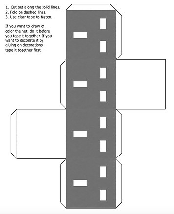
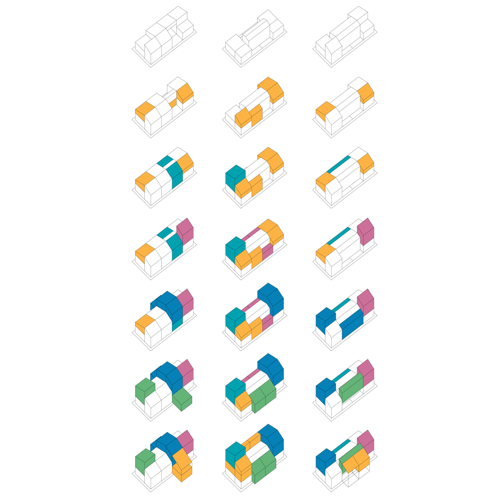
As our layouts were focused on mass produced buildings of the 21st century. We thought that it would be interesting to take this aspect, and create a workshop where people could interact and therefore learn a bit about the subject through producing. With this in mind, we initially came up with the idea of using net shapes in order to built a selected amount of shapes chosen from our final layouts. We wanted to allow people to build the elements in which conjoined, makes a three dimensional version of our layout as by building the element, this process of building and then resembling in order to create a structure is quite reminiscent of modularity within architecture and repetition. Furthermore, by providing limited choice of shapes in which they can build, we will be able to represent how mass produced buildings are often built as a solution for the lack of houses rather than to cater to the needs of the people who will live in these buildings.
However, we felt that even though through allowing people to construct their own module, we are unable to suggest the precision aspect of mass produced buildings as by allowing our audience to build their own cubes coupled with the flimsy nature of paper, the outcomes are quite susceptible to human error and therefore won't be as precise as cubes built in factories.
Further Development.


Apart from the print itself, the paper in which the print is layered upon also plays an important role in conveying our narrative through our work. Much like Karel Williams, we felt that by using found paper, it can be a really interesting way in suggesting any underlying ideology or narrative that led us to create these images. Therefore, with this purpose in mind, we have decided to experiment with various types of paper in order to find which type and/or colour of paper that lends itself to our prints and its colours most as well as be able to suggest the ideology behind the prints.
We have decided to experiment with placing examples of what might possibly be our final prints on an oatmeal coloured background. We have chosen to experiment first with a background with such colour as due to modern houses built with the goal of creating habitat for humans, and therefore, could be interesting for us to print our layers on to it, suggesting the idea of the government bestowing a sort of made up environment for the public and as oatmeal is often associated with the idea of something being organic and non man-made, we can therefore suggest that humans in a way is interacting with architecture by providing other humans with a suitable habitat, much like what the British Government is trying to do by mass producing housing estates all throughout Britain in hopes of combating the housing crisis hence, the imagery of modern architecture being layered on top of the paper.


In the same way, we have decided to experiment with layering our prints onto paper documents and other kinds of paper that is often either used or associated with architecture and the housing crisis for example, blue print or any government document template in hopes of being able to suggest the reason that led to the need of these massed produced housing estates in the first place. I suggested using these documents because I was really inspired by the effect the paper had on the narrative and the context of Karel William’s Letterpirnts on paper and therefore wanted to experiment using this technique.


However, even though, contextually, using consistent background in all our prints were very good, visually we felt that the business of the blueprints took away from our prints and therefore they didn’t stand out as much.
We have also decided to experiment with placing these example layouts on top of grey paper as similarly to oatmeal, the grey really enhances our choice of colour. Furthermore, the colour grey is often used in modern houses and modern architecture due to materials like metal and concrete being grey in nature and likewise, due to mass production being done in factories with a high level of precision, we also felt that by placing our layouts onto grey paper, we are presenting our layouts as a mould.


However, once we’ve layered our print examples onto the blueprints, the difference in blueprints didn’t work together as strongly as we have hoped. Therefore, we have decided to experiment with using only one type of blueprint for the background in order to tie all the layouts together as well as suggest the idea of repetition within our prints and therefore, represent mass produce housing.
Furthermore, in addition to wanting to convey our layout as a mould, used in mass produced housing, due to the nature of mass produced housing and a lot of them being retailed unfurnished, we thought that it could potentially be quite interesting to print our layouts onto plain white card. I personally wanted to experiment with using white card as I felt that by eliminating all other noises, the grey ink used in our layouts would contrast quite strongly against the stark white, resulting in the prints looking quite authoritative and imposing, much like how mass produced housing is designed often as a solution for a lack of housing as supposed to being designed to individual needs of the families and therefore often times the design will not have any relationship with its residents.
The Housing Crisis.


93,000 children in Britain are homeless, rents have shot up across the country, and we’re building less than half of the affordable homes we need. In Norfolk, 237 households are homeless. The house prices have risen by over £200,000 since 1969 and have gone up 11% in the last three years alone. Hence, less households are able to afford and therefore turn to renting resulting in a 7% increase. There also aren’t enough affordable homes with 600 only built in 2014. Council leaders therefore have warned that more homes need to be built because more than 5000 people are in need of affordable housing. Gail Harris, deputy leader at city hall said at any one time Norwich has up to 250 ‘roofless people’ - including people sleeping on sofas and up to 35 rough sleeping. She said, this year, the council has spent £220,000 on temporary accommodation for homeless households - with 80 people in temporary accommodation at any one time. And she said there are 4,744 people on the Home Options register, waiting for housing. “We know our local demands and the local housing market - we should be given more control to do something about it.” she said. Harris also said recent Norfolk County Council cuts - including £4.5m being taken from a budget used to commission services from charities and housing providers - was “quite likely” to “see increased numbers of people losing their accommodation and then perhaps sleeping rough on the streets” and therefore would be beneficials if the council would be issued more money to develop services for rough sleepers, such as The Housing First Scheme in The United States, a scheme that aims to stop rough sleeping by getting homeless people into permanent housing to make it more likely that issues such as drug addiction, alcohol abuse and mental illness can be tackled and solved.
So imagine we had a government that was genuinely determined to solve the housing crisis. What would it actually do? We should begin by accepting that the private house builders were never going to solve this problem for us. The amount firms pay for land is based on the price they’ll be able to sell homes for. They’re never going to build homes at a rate that could make prices fall, for the very good reason that they’d all go bust if they did. A government set on a real solution to the housing crisis would abandon ministers’ touching faith in the power of markets. Instead, it would invest in a huge increase in social housing, loaning money to housing associations, to get them building, and allowing councils to borrow money and build homes on their patch once again. This would require a change in attitudes towards public debt, and an understanding that council housing was a long-term investment – an asset, rather than a slightly embarrassing relic of a bygone age. The standard answer to 'where will we build new houses' is “brownfield” – conveniently vacant land that’s already been built on, and so won’t offend too many people if it’s built on again. But the truth is that, in much of the country, there isn’t enough of that to go round. If we’re actually going to meet demand for new homes, we have only two options: we can either build up, or build out. Real world governments have shown themselves more than willing to redevelop those – but they’ve generally tried to do so on the cheap, maximising the number of private homes available at the expense of social homes, and repeatedly breaking promises to tenants. More social housing, denser cities, and properly planned new suburbs need to be done so that in these three ways, a motivated government would be able to end the housing crisis in just a few years. It’s only a pity that a government like that seems like science fiction, too. More than 200,000 homes in England with a total value of £43 billion were empty for at least six months during 2016 despite the desperate shortage of properties to rent and buy. As a result of this, squatters groups have sought to occupy empty homes, with one group in January taking over a £15m central London property purchased by a Russian oligarch in 2014 to open it as a homeless shelter.
Le Corbusier's Housing Project.
"La Cité Radieuse" by Le Corbusier, in Marseille, France is the project which is often credited with (or blamed for, depending on your point of view) making popular both brutalism and high density social housing. Most of the copies around the world became crime-ridden tenements, and many have since been labelled as errors in social engineering, and have been demolished. But the original still stands proudly, inhabited today by mostly upper-middle class, educated residents who are proud of their building and what it stands for. Charles-Édouard Jeanneret - aka "Le Corbusier" - was a visionary, and already world famous in 1945 when France was turning to its architects for new and innovative solutions for housing the country's population in the years following the massively destructive World War II. The architect had already drawn up plans for his modern "Ville Radieuse" in 1924, and had even published a book on the topic in 1933. He had grandiose visions about housing millions of people in towers, and about demolishing both the buildings and the urban fabric of the past. But until then, Le Corbusier had never built anything at that size or scale. The architect was mostly known for designing and building private villas for wealthy people.
When he stepped forward after the war and expressed his desire to rebuild France's demolished city of Marseille (which had been destroyed by the Germans in 1943, and then subject to Allied bombing intermittently thereafter), the French government didn't quite trust that he would be up to the task. Instead of rebuilding the entire city, he was awarded the task of realizing a prototype building in Marseille that would emulate many of the points he had been making about his Ville Radieuse concept. Originally, this was intended to be social housing for the poor. Residents would be able to do their shopping within the building, and even call the shops from direct phone lines to order goods. Deliveries could be done without needing to be home, through specially built delivery boxes in the hallways that communicated directly with the kitchens of each unit. The idea was to create Unités d'Habitation (Living Units), that were largely prefabricated and simply slotted into a steel frame.The whole building would be scaled based on Le Modulor. This was Le Corbusier's own system of measurements, based on the human scale, the golden ratio, and the Fibonacci number. He decided that the ideal human figure was 1m83 tall, or 2m26 with his arm raised.


Le Modulor
La Cité Radieuse
Le Modulor
The Modulor is an anthropometric scale of proportions devised by Le Corbusier. It was developed as a visual bridge between two incompatible scales, the imperial and the metric system. It is based on the height of a man with his arm raised. Le Corbusier developed the Modulor in the long tradition of Vitruvius, Leonardo da Vinci's Vitruvian Man, the work of Leon Battista Alberti, and other attempts to discover mathematical proportions in the human body and then to use that knowledge to improve both the appearance and function of architecture.
The system is based on human measurements, the double unit, the Fibonacci numbers, and the golden ratio. Le Corbusier described it as a "range of harmonious measurements to suit the human scale, universally applicable to architecture and to mechanical things". With the Modulor, Le Corbusier sought to introduce a scale of visual measures that would unite two virtually incompatible systems: the Anglo Saxon foot and inch and the French metric system.
Modular design or “modularity in design” is a design approach that subdivides a system into smaller parts called modules or skids that can be independently created and then used in different systems. A modular system is characterised by functional partitioning into discrete scalable and reusable modules, rigorous use of well-defined modular interfaces and making use of industry standards for interfaces. The benefits of modular design are flexibility in design and reduction in costs. Examples of modular systems are modular buildings, solar panels, wind turbines and so on. Modular design combines the advantages of standardisation with those of customisation. A downside to modularity is that low quality modular systems are not optimised for performance. Modular architecture has functionally de-coupled interfaces between components. In practice, this often leads to architecture that is one, where the functional elements in the building are mapped one-to-one to the components of the design.
Modularity means using the same module in multiple configurations enabling a large variety of designs without using many component types. This modularity brings several advantages such as reduced capital requirements and economies. Modularity is especially advantageous when the scale and scope of the project are relatively large. In such cases, it is a practical and economic option. Through modularity, you can achieve various designs, while achieving low-cost for development, as well as, cost saving in design and construction. Thus, you find that modularity is pushing out the productivity frontier in design creation (McCluskey, 2000). However, modularity may lead to excess cost due to over-design, inefficient performance, and too many common modules may result in loss of design identity.

Tatiana Bilbao's flexible building prototype that offers a solution to Mexico's social housing shortage
For the final printing session, we have decided to go with blue, orange and grey as supposed to the initial blue, yellow and grey. We have decided to go with orange as supposed to the initial yellow as the yellow was picked out with using acetate filters in mind, and as the idea is no longer, we have decided to go with an equally bright colour but a bit darker. We decided to go for a similliar colour but a bit dark due to when we used the yellow ink in our second relief printing, we found that the colour blended to much with the background and therefore by using orange, not only will the orange compliment the blue, it will also stand out against the grey paper. Furthermore, the fact that the colour stands out so much against the paper allows for the effect of an isotype, easily read from even far away. We felt that it was important for our print to be able to be perceived even from far away as we felt that by having such strong graphical language within our layout, we would be able to mimic the way modern mass produce housing is built specifically for a reason, a very straight-forward process. We also felt that by introducing colours that contrast so strongly against the paper, we will be able to mimic the authoritative, imposing and quite aggressive nature of modern housing. We have also picked orange due to the colour being of a warm nature and therefore suggesting heat and when used alongside the blue, a colour often seen in colour and associated with water, we will be able to reflect the main elements that allow houses to become inhabitable. We have decided to stick with grey even though we have changed to grey paper as grey is often seen within modern architecture due to modern materials like steel and concrete being grey in nature and therefore, by incorporating grey within our prints, our layout can appear more reminiscent of modern housing.


Finalising our chosen colours and shapes.
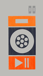
For the final printing session, we have decided to laser out all of our chosen shapes again to prevent any changes of prior layers of ink contaminating the new layer. We have also decided to revisit some of our shapes as during our group crit with Peter, it was brought to our attention that some shapes for example the LED display, were not developed enough and therefore not as graphically strong as it can potentially be. Therefore, we have decided to turn the round edges of the led display to sharp corners excluding the two dots in the middle in order to link the shape more to the other shapes that are of the same nature i.e the plug socket. We have also decided to change our light bulbs to a newer more relevant model of lightbulb as similarly to the led display, the shape felt undeveloped and wasn’t as graphically strong as the rest and by changing the lightbulb into more recent models, our prints are made more relevant to 2017 and therefore is able to address the mass production housing that is going on currently. In order to create the lightbulb, we have turned to road signs and isotypes in the 20th century in order to see how designers like Otl Aicher use negative space in order to achieve clarity, even from a distance. We have found that even since we introduced the use of negative space, our shapes have all been more visually refined and therefore when placed next to each other, we were able to even more, highlight the idea of precision within mass produced housing as well as the idea of the “le modulor” used to design them. Moreover, the angular lines when placed next to each other also appear quite visually clinical, furthermore emphasising the idea of mass production precision.


Isotypes.

Isotype (International System of Typographic Picture Education) was developed as a system of pictorial statistics at the pioneering Museum of Society and Economy in Vienna between 1925 and 1934 (and was first known as the ‘Vienna method’). Under the direction of Otto Neurath, a social scientist and prominent member of the Vienna Circle of (anti-)philosophers, a coherent set of rules emerged for transforming complex, statistical information into self-explanatory charts using elemental pictograms.
The influence of these pictograms (designed from 1928 by Gerd Arntz) on today’s information graphics is immediately apparent, although perhaps not yet fully recognised. ‘Visual education’ was always the prime motive behind Isotype, which was worked out for exhibitions designed to inform ordinary citizens (including schoolchildren) about their place in the world. It was never intended to replace verbal language; it was a ‘helping language’ always accompanied by verbal elements.
Fig 1: We have designed this layout with the idea of visually reproducing the appearance of a block of mass produced housing. We wanted all of our rows to be evenly spaced and of the same height with when two squares are placed on top of each other, their height, with the addition of the gap in between would equal the height of a rectangle. We payed special attention to this as aspect as our shapes were designed in order to represent modules within architecture and by proving through our layouts that multiple modules can be combined to create a structure, we are suggesting that “Through modularity, you can achieve various designs, while achieving low-cost for development, as well as, cost saving in design and construction. Thus, you find that modularity is pushing out the productivity frontier in design creation” (McCluskey, 2000). Furthermore, we wanted the layouts to even though are dimensionally repetitive of each other, to be made up of different components. We wanted to do this in order to suggest typologies amongst modern mass produced housing and the different people who even though are different, all have to conform into this one design. However, we felt that the two bottom elements in the first layout didn’t work well with each other due to both containing a circular element and therefore, we moved on to experimenting with another layout.
Fig 2: In the second layout, the idea of visually reproducing the appearance of a block of mass produced housing is still priority, with all of the rows evenly spaced and all columns being the same height. Even though we felt that the shapes within this layout slotted together more together, the two final layouts ended up being repetitions of each other and therefore, looked different and separated from the rest and hence, weren’t as visually representation of mass produced housing as we wanted.
Further Layout Development.


Fig. 1
Fig. 2
Fig 3: In our third layout, the idea of visually reproducing the appearance of a block of mass produced housing still remains top priority, with all of the rows evenly spaced and all columns being the same height. However, we have decided to place all of the horizontal rectangles on top of all out the layouts to furthermore mimic repetition within mass produced housing. Furthermore, as the rectangles are all placed on top, the layouts themselves are very visually representative of a modern flat and therefore when the layouts are place alongside each other, the layouts as a whole resembles a block of modern mass produced flats. We decided to go with this layout in the end as we felt that the layout resembled mass produced housing the most both visually, and conceptually.
Fig. 3


For the exhibition, we have decided to experiment with placing our prints in three different ways- all alongside each other in a row, stacked upon each other, and in a grid. We wanted to experiment with placing our prints in a row as we felt that by placing our prints, evenly spaced in a row, we will be able to visually represent a row of modern mass produce houses. We thought that by placing the prints this way, we will be able to represent the notion of repetition and precision within mass produced housing.
We also experimented with the option of stacking them one on top of the other as our shapes are made with the purpose of representing a module and by stacking the layouts on top of each other and therefore ultimately creating a new layout, we are able to mirror modularity and repetition within architecture.
Lastly, we decided to experiment with placing our prints in a grid as when placed in a grid, we will be representing a block of houses. However, even though by placing our prints in this format allows us to mirror mass production and repetition, we won’t be able to create a perfect square out of six A3s and therefore, will not be able to represent mass production as strongly as we would have liked, as a square would be reminiscent of the squares included within our layout and therefore further highlight modularity and precision- keys components of mass production.


 |  |
|---|---|
 |  |
 |
On Thursday, my group and I were able to print out various shapes that we have produced from architecture and objects we habitually interact with out of 3mm MDF. Having the shapes all laid out in 3D gave us the ability to move around and layer shapes on each other, creating compositions and layouts that we find work most. Despite not having a clear plan or idea of what we wanted to do/ achieve prior to this session, I still felt that this session was still really helpful in terms of informing us about what shape works or what colour combination works. Therefore by the end of the session, we as a group were able to decided on a group of colours that we all felt worked and have decided to use more symmetrical shapes.
Process.
First Relief Printing Session.

Final Development.

After our final relief printing, my group and I have decided to come back together and critically analyse the outcomes of the printing session and discuss whether or not there were any compositions we though might lend itself conceptually as well as visually better than the one done. This was when a group member suggesting we try duplicating some of the columns and place them evenly on to the paper in order to create what she thought could potentially visually represent a row of mass produced houses quite well. She wanted to experiment with this layout due to the modern mass produced houses and flats being introduced into her city and have now sort of taken over, appearing more and more throughout the city. Therefore, when placed on six adjoined A3 sheets of paper, the prints turned conveyed a very opposing and authoritative look to it. Therefore, suggesting that ever since its introduction, modern mass produced housing is now the new norm.
To begin to creating the row of buildings, we scanned in our original prints and cut around all the shapes digitally so that the group member, Louise, who is uncharged of photoshop could edit and move them around freely. She altered all of the colours slightly, ensuring that the digital version stayed true to its real counterpart, and the scanning process did not change anything. The spaces in between the building then has to be payed particular attention so that the space in between the shapes within one column were equal and of one third of the space in between the actual column themselves. We payed particular attention to this feature as our shapes are inspired by ‘Le Modulor’ coupled with the idea of precision and repetition within mass production hence, through making sure that the spaces in between are all even, our prints will be able to visually represent this feature. Furthermore, the columns, even though not made of the same shapes, have to all be of the same exact dimension i.e the height and the width as we felt that by achieving such precision, we would be able to mimic how modularity work within the modern mass produced housing. With this in mind, we then created guides on the page in order to line up al the shapes, ensuring that the buildings matched up even in the cases where overlapping occurs onto another page.
After consulting with Peter, we were then advised to make middle column the focal point, potentially through only incorporating the orange shapes within them and not the layouts on either side hence, allowing depth into our layouts. From this, we decided to experiment with creating said layout and simply changed the colour of the blocks of Photoshop. Going through this process digitally definitely helped us in terms of efficiency as by experimenting digitally, we were able to churn out all of the ideas suggested by our group members a lot more quicker than if we were to produce them through relief printing. Digitally experimenting also allowed us to see previews of what the final layout of our ideas will look like in cases where there were a clash of opinion, compare them, and then as a whole, vote on which layout suggested works best for our ideas in terms of visually as well as conceptually representing them.

However, after seeing how these layouts turned out, although visually representative, we didn’t feel that the layout as a whole worked as well in terms of conceptually representing our ideas. Furthermore, Peter also advised us to honour the A3 in relation to our layouts. Therefore with this in mind, we decided to go back to my idea of placing all of the columns individually, right bang in the centre of then separate pieces of paper. As our ideas stem from precision as well as repetition in mass production, I thought that by placing the columns separately, I will be able to visually represent the moulds often used in mass production as well as the housing in which is being reproduced many times over in order to create more housing. Furthermore, by eliminating the amount of noise surrounding the layout, I felt that the columns contrasted even more with the paper, appearing more bold and reminiscent of isotypes. On the same note, by appearing bold and reminiscent of isotypes, the layouts were then able to suggest how modern mass produced housing are retailed usually, only equipped with the basic necessities i.e plumbing, electricity and heat, that allows the inhabitants perform basic daily routines, but not much else. Similarly, by having the layouts be the focal point, visually, it is easier to see the individual shapes that make up the individual columns, furthermore representing the idea of Le Corbusier’s ‘Le Modulor’.


Working in a Group.
Working in a group has allowed me to develop my communication skills as well as be able to compare, contrast and compromise whenever there was a disagreement in opinions within the group. Due to having come from different creative practice backgrounds, we all had a different relationship with the group practice and hence, brought new ideas to the group where others would not have thought about. Initially, we got together and discusses our strengths as well as weaknesses in order to assign appropriate roles that will allow us to work efficiently as a group. Due to having prior background knowledge in architecture and strength in analysing, I was able to provide underlying context and worked efficiently in tying the studio practice to the conceptual side and therefore I was assigned as a researcher, researching more into the context and ideology that inspires the creative practice that will allow our group work to be as conceptually strong as it is visually. I have thoroughly enjoyed being the researcher of the group as I felt that I was able to bring more to the table and help the group make decisions that are not only because of “how good something looks” but whether or not the layout portrays what message we are trying to communicate across. For example, after our group crit. with Peter, my group members all really liked a specific print (see Fig.1). However, when I asked them the reasoning behind the fondness, the only reason I got back was because of how visually strong it is and due to being the person behind making sure our layout is as conceptually as strong as it can potentially be, I asked for a group meeting and explained to my group the reasoning as to why I felt the layout will not work. As our layouts all stem from Le Corbusier’s ‘Le Modulor’ coupled precision with mass produced housing, the tilted components within the layout just weren’t able to represent such ideas. Even though it was challenging, I really do feel that the conceptual component is important when developing a layout and therefore more often than not, I have had instances where I had to hold a group discussion in order to make sure that our decisions were all concept and idea based and that everyone keeps concept in the forefront. This experience has helped me as well as my practice grow significantly as it has gotten me into the routine of developing the conceptual and ideas side first before any visual development.
Working in a group has also taught me how to do things outside of my comfort zone including public talking, conducting a workshop and taking lead. Due to unfortunate circumstances, our group weren’t able to meet up as much as I would have liked therefore, in order to not leave anything to the last minute, I found myself having to take lead and gather our group together in order to make sure that the group practice is not put to a halt. Furthermore, through leading such group discussions, I was able to see how different students perceive certain visual work and therefore when conducting the workshop as well as preparing the prints for the exhibition, I had payed more attention to the public and how I want the public to perceive and interact with our work. I have also learnt to become quite persistent in making sure the conceptual side of our practice is up to par to ensure that our layouts are strong in all aspects.

Fig. 1
With this in mind, I then went on to produce what I think would be a good starting point. Due to basing my shapes on the different elements found throughout my house and the fact that my house was only built in 2015, the visuals of all of the elements therefore were very modern and minimalistic. This, coupled with my inspiration from Karen Williams’ prints, led me to produce these images into quite simple, geometric two dimensional shapes. I made them mostly conform to one standard i.e in a square, because I felt that as there are n a lot of houses had to be mass produced as a solution for the housing crisis and therefore end up looking like repetitions of each other and therefore by having all my shapes conform to one shape, I am able to reflect the repetition shown within these houses.
I also designed my shapes to reflect the way modulor is used in architecture and therefore by containing them in a square or in shapes that can be joined together to achieve a square, this process of layering and building in order to create new imagery I hope, would be one that reflects how architecture works. For example, by layering the square that had what appears to be the plug socket beneath the square just below it , I would be suggesting that in order for the heater (what the square was inspired from) work, I would need electricity (represented by the plug socket).
I have decided to use a plug socket instead of a flash symbol as I felt that although electricity is the main necessity that runs throughout the house, the residents only interact with electricity through devices and plug sockets, therefore the plug socket themselves are what the residents interact with most. Similarly, I have also decided to represent only the parallel planes seen on the exterior of my heater in my shapes as I felt that the model of heater installed in my house is quite a classic model, wildly used and therefore also suggests the notion of being mass produced.